December 20, 2004
 The Lost Admiral Returns
by peterbThe best game I've played in my recent spate of reviewing is, without question, The Lost Admiral Returns. You've heard the clichés applied to other games: easy to learn, hard to master. This time it's true.
Some purists divide games into two camps: those that involve random chance (typically through rolling dice), and those that don't. The latter type are sometimes called "pure" games. In my experience, people who are better at games prefer purer games, because their gigantic brains help guarantee them the win. They aren't cheated of their victory by a random roll of the dice.
Because I'm actually pretty unskilled at anything that involves more planning than figuring out what I should have for lunch, I tend to lose at pure games, which means I usually don't like them as much. The Lost Admiral Returns is the exception that proves the rule. Let's review the basics of the game.
The Lost Admiral Returns is played on a hex map depicting water and land; pieces move only on water. Cities, with attached ports, are based on land, and are worth victory points. In order to own a city (and thus accrue victory points from it), a player must have a troop transport stationed in the harbor of the city at all times. A city with no transport in the harbor is neutral, and no one gains points from it.
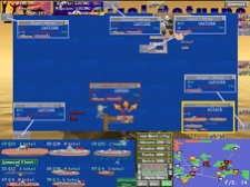
At the end of a turn, up to two friendly ships can share a hex without negative consequences. If ships from opposing teams occupy a hex at the end of a turn, they fight. Ships can move a certain number of hexes per turn; if they enter a hex with an enemy, they must stop. In addition to the two types of troop transports, there are PT boats, destroyers, submarines (both submerged and surfaced), aircraft carriers, cruisers, and battleships. Normally, you can only see enemy ships if they are in the same hex, so the fog of war is heavy and thick. Aircraft carriers can detect enemy ships -- except for submerged submaries -- up to two hexes away.
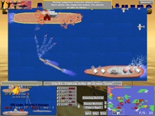
There is no die-rolling here. Rather, combat is very rock-paper-scissors. A submerged submarine can do substantial damage to a battleship, but the battleship cannot hurt the sub at all. A destroyer can sink a submerged sub in one shot, but the sub can barely dent the destroyer. A battleship can squash a destroyer like a bug; a destroyer barely tickles a battleship. Combat is resolved nearly automatically. There's a little animation of the ships shooting at each other, but there is no dexterity involved (except the occasional need to click on a ship to indicate that you want to target this enemy rather than that one.) Movement between the player and the computer alternates in turns. It can be a bit of a burn to attack a battleship with your sub, only to have the other player move a destroyer in to take you out on the next turn; of course, you're trying to do the same thing to him as well.
Gameplay is fast-paced, for a hex-based wargame, and addictive. I constantly find myself saying "Just one more battle before bed," which is a sure sign of incipient dependency.
Battles are wrapped up into a somewhat baroque but fun "career mode," wherein you have an overall rank (based on how many battles you've fought) and class (expressed as a colour, based on how well you've done in those battles). So a blue ensign has fought more battles than a gold master mate, but the latter did better, on average, in his fights. As you finish battles, little medals begin to decorate your career screen. It makes a cub scout's heart glow warmly to see these little merit badges accumulate. If you needed any proof that war is really about boys and their toys, it's right here.There are nine pregenerated maps, and a nice variety of options to generate random maps. There is also a campaign mode, called "Save the Admiral," where you fight a large number of set-piece and random battles. Sprinkled in among the games, particularly in the campaign, are additional missions where you are responsible for more than simply amassing the most victory points. For example, in the "Secrets" mission, you need to perform reconnaissance on certain hexes deep in enemy territory. The "Fishing Territory" mission requires you to defend certain sea hexes from enemy incursion. "Death By Duel" requires you to try to destroy certain enemy ships with certain designated ships in your own fleet. In order to win a mission battle, you have to make your victory point quota and fulfill whatever the terms of the mission are. Completing the mission successfully usually isn't hard; getting enough victory points usually isn't hard. Doing both at the same time is surprisingly hard.
Completing battles -- again, particularly campaign battles -- gives you a variety of rewards that you can use in future combat. For instance, there are a variety of points that can be used to buy special abilities for a flagship (that can be used in only one battle) -- move faster, better radar, and so on. There are also "power plays," that can be used if you want to even up a tough battle a bit -- the "traitor" play, for example, causes several enemy ships to mutiny and join your side, whereas the "spy" play reveals some of the enemy's ship positions to you. When I first read the description of these abilities, I thought they were a bit cheesy; some sort of way to reward the player by letting him cheat.
But it turns out that the computer players accrue these rewards also. In the last game I played, the computer played both "traitor" and "spy" plays against me. So as far as I'm concerned, the gloves are off.
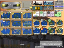
The setup for a battle is one of the most well-designed parts of the game. For every battle, you must determine which ships you're going to purchase with your initial allocation of points. First, you can blow it off completely by just clicking "Auto Buy," and letting the computer pick for you. That's a great optimization for a busy player who wants a comparatively quick game. If you want to, though, you can reasonably spend as much time picking your weapons as you do actually playing the round. You set a mission for each victory point (capture, attack, raid, defend) and set a monetary budget; then you can assign ships to that port's mission. It's both fun and disturbing to watch your carefully laid plan completely unravel after the first few skirmishes.The Lost Admiral Returns is not an online game; all battles are against the computer. The AI can be set to one of ten levels; I found level 1 to be trivial to beat, and have slowly been ratcheting the difficulty up. So far, I just barely managed to defeat a level 5 opponent, so the difficulty ramp feels about right. To the best of my knowledge, the computer isn't cheating. After each battle, you are given the option to post your scores on the internet and see how other people did on the same map, against the same AI you played. That can be pretty humbling.
So, there's a lot to love about The Lost Admiral Returns. The game concepts are simple to grasp, but provide a lot of tactical depth. The opponents are strong, and there's a sense of reward for progressing through the game. Are there any downsides to the game?
Well, there's basically one problem. It's not a huge problem, but I'd be remiss if I didn't mention it. When I started up the game for the first time and got into the tutorial, I said to myself "Wow, this game looks exactly like the old game The Perfect General, from QQP, from way back in 1991." See, I hadn't paid any attention to the word "Returns" in the game's title -- this is Thurston Searfoss's update of the original Lost Admiral game, also published by QQP. The game feels the same. It has the same little almost-but-not-quite square buttons and the same sorts of hand-drawn icons. Tooltips pop up in hand-coded dialogue boxes that are not generated by any toolkit you've ever seen before. The UI would be considered advanced, if this were a DOS game written in 1990. But it's not 1990.
This is not a problem specific to The Lost Admiral; in fact, let's take a brief detour to talk about the subject.
It is pretty much par for the course for game designers who know nothing about Human-Computer Interaction to throw away the style guide for whatever platform they're coding on and instead develop their own unique interface for their games with visual, tactile, and response time characteristics unique to their game. This drives me insane. For some truly pathological cases, try the following examples: Fire up Windows and move the mouse around a little. Get the feel of it. Now start up Deus Ex, or Europa Universalis and move the mouse around. It will have a completely different feel -- in Deus Ex, the cursor movement feels slippery, like you're driving on ice. Europa Universalis' mouse control feels like you're driving through deep mud; you have to move the mouse twice as fast to travel the same distance as in Windows proper.
Most games have to have some user interface specific to the game ("clicking here does this," "moving the joystick does this"). But this specific act of throwing away platform standards and building your own behavior for every single aspect of user interaction disturbs me. Therefore, I will call it "overcreating a UI". Maybe overcreating a UI makes sense in certain situations (for example, your game is going to be ported to a bunch of different platforms, and you want them to look consistent across all of them). But on the whole, this feels like a morass for game developers, where they have a mission ("design and implement a game that's fun") and then sign up to overcreate a UI without thinking about whether it's really appropriate. In the early 1990s, a number of companies actually designed their own extended memory managers rather than using Windows or existing DOS memory infrastructures. Origin's memory manager for Ultima 7, for example, made the game amazingly painful to play. I think in years to come, games with overcreated UIs will be seen the same way.
It's one thing if you've got an HCI expert on your team who is going to help you create a UI that's as good as Windows or OS X. But most smaller developers don't have that expert. So by developing their own custom buttons and cursor-movement code, all they do is make their game look more distinctive -- which may be good -- and subtly irritate all their users on a subconscious level, as various UI elements act almost, but not quite, like the elements they use in 90% of their other activities.
And that's the big drawback of The Lost Admiral. It has a massively overcreated UI. This is constantly with you as you play. Apart from the obvious issue of the buttons not being pretty drop-shadowed Windows buttons, there are other annoyances. The game is full of tooltips which pop up as you scroll the mouse around the screen, sometimes obscuring what you actually want to read. The game pauses and continues during the computer's turn without waiting for user input, but displays a box with a "continue" button for three quarters of a second, just long enough for me to start moving the mouse to try to click it. To select ships, you have to right-click, which changes the display in a manner so subtle as to be imperceptible if you're not paying close attention. Then, to move a ship you left click. I've made bad moves in a couple of battles because I accidentally left-clicked and sent a ship sailing off into somewhere it was never meant to go. Compare this to the UI in Panzer General. When a unit was selected, the hexes to which it could move to were normal and all other hexes were practically opaque. It was extremely visible. This was an instant visual cue to the user to Be Careful. Also, in Panzer General if you clicked outside of the permitted movement area, you deselected the unit; in this game, the unit will move as far as it can towards wherever you clicked.
None of these interface issues ruin the game. The developer is aware of them, and is working on addressing the most pressing ones (which you'll read about in the next few days, when we publish our interview with him). I highlight them only because the gap between the superb game design and gameplay and the dowdy, hand-rolled interface is so stark. If there's anything that will turn players off the game, I think it will be the interface.
Lots of information on The Lost Admiral Returns is available at the game's web site. There's a very generous 30 day trial period in which you have pretty much full access to all of the game's features. If what you've read here interests you, I encourage you to download the demo (for Windows PCs only, unfortunately) and give it a try.
Posted by peterb at December 20, 2004 06:59 PM | Bookmark ThisI think you've mentioned this before. You have to bear in mind that Windows GDI code and DirectX do not play nicely together. Ask Windows to give you a message box when you're doublebuffering in DirectX and there's a 50% chance it'll be drawn to the wrong buffer so you can't see it. Request GDI-compatible surfaces for DirectX and you'll see your frame-rates drop. Use plain MFC and owner-drawn controls (because gamers might appreciate something that feels like Windows, but they certainly don't want it to look like Windows) and you'll probably get something that feels smooth and looks nice, but it'll still be really slow (by game standards) and will require the game developer to have decent Win32/MFC skills on top of all their other game development skills. So for any small developer, it's likely that quite the opposite of what you say is true, as it is arguably quicker and easier to write their own GUI code (or use one of the many open source GUI packages) than try to wrestle with using the platform's native system within a game.
Posted by Ben Sizer at December 20, 2004 07:43 PM> (because gamers might appreciate something that
> feels like Windows, but they certainly don't want
> it to look like Windows)
I hear this all the time. It's certainly the common wisdom. Is it really true?
One aspect I tried to suggest in the discussion of UI but I didn't say explicitly is that the inputs required for the game impact how much UI design one should be doing. Obviously, if all the inputs for a game are expected to come from a gamepad -- left/right/up/down/shoot -- then there's no real need to make the game look (OR feel) like Windows. I think, however, that games that require you to use a mouse for pointing and clicking activities present a stronger case for using a more consistent look and feel. I know that everyone _thinks_ gamers will reject games that use standard GUI elements, but I've not seen any actual evidence of that, since so few have tried. Have you ever met anyone who thought that Spaceward Ho! (to pick one example) was less fun because it used standard MacOS GUI elements?
Lastly, there's a middle ground between "use ugly Windows dialogue boxes and textareas for everything" and "rewrite the mouse tracking code, only get it slightly wrong, driving the user insane." As you point out, correctly, probably the most important thing is that the apps _act_ like the users expect, regardless of how they look.
I'm going to wave my hands at the DirectX performance issues and say that if solving them is important, they can and will be solved. I'll also mutter something about Moore's Law under my breath.
Posted by peterb at December 20, 2004 08:55 PMAs a gamer, one of the main reasons I really really hate games that use the standard Windows GUI is because 99% of games I've tried that use it do such a half-assed job. Like they'll use all the buttons and controls, but hard-code all the text to be one color. And invariably that color only looks good if you're using the default grey Windows color scheme. Change it to even one of the other presets that come with Windows and the text will be invisible. Or if you switch to large fonts, you can either see only half of the text on all menu choices or the game screen gets horribly corrupted.
Admittedly, there'll be problems no matter what if they're not testing their program with even slightly-modified configurations. But I'd rather encounter a piss-poor, ugly interface and blame it on the programmer not being able to draw (see Everett Kaser software) than one that completely breaks simply because I like the color blue more than grey or I like to sit more than 10 inches away from the monitor. If your software makes me open up the control panel, I'm clicking 'add/remove programs' before 'display properties'.
Posted by misere at December 21, 2004 11:06 PMPlease help support Tea Leaves by visiting our sponsors.


